


ETC — Source Four LED
| CREATIVITY | COPYWRITING | MEMORABILITY |
 |
 |
|


This is a solid example of less-is-more, and ETC has used layman’s terms to communicate the felt need and demonstrate their value proposition. No hard sales pitch on LED’s long life or the lack of heat generated by the fixture. Instead, they cleverly included a simplified Kelvin range graph with common colors used instead of color temperatures but demonstrated a technical benefit of the device’s uniformity in a way that even the non-technical readers would instantly understand.
Finally, this includes a definitive statement and a quantified value: “Better color. Now twice as bright,” setting the expectation of the end-user for a positive experience.
In my opinion, the only potential improvements are for a stronger call-to-action and a specific landing page URL for their marketing and sales teams to track the click-through and response rates to the ad.
Martin Audio — MLA Compact
| CREATIVITY | COPYWRITING | MEMORABILITY |
|
|
|


As good as the images are for setting the tone of the ad, the verbiage usage will resonate with a high percentage of church buyers. “Uniting the congregation.” “Speech and music that stir the soul.” “It’s all about consistent audience coverage, front to back, whatever the acoustic challenges.” The key words here are uniting, consistent, and experience. The two great phrases are stir the soul and a shared experience. It doesn’t matter if a technical director or senior pastor reads this ad because it speaks to both personas. Word choice matters in ads, and Martin Audio was wise and judicious with verbiage usage.
Martin wisely chose not to use pandering terms or weightless words, a common mistake in A/V/L advertising to the H.O.W. market. Their copywriting is spot on, using descriptive language to identify with the felt need of the user and simultaneously clarify the value proposition. Even the call-to-action text “unite your audience at www.martin-audio.com” reinforces the opening statement of the ad. That kind of intentionality is subtle but important.
Once again, the big miss on this ad is not providing a specific landing page URL for their marketing and sales teams to track the click-through and response rates to the ad.
Roland — VR-50HD
| CREATIVITY | COPYWRITING | MEMORABILITY |
|
|
|


There’s a lot to admire in this full page ad, from the strong lead to the specific language about usage applications to the example setup diagram, to the praise of five awards, to the high quality product shot. They key words were webcast and produce, especially within the context of aiming at simplified, consistent operation. This advertisement maximizes the investment in a full page ad by wisely using the real estate to highlight the value proposition, key features and earned accolades. It even includes a specific URL to the VR-50HD.
Because this ad appears in both print and digital editions, the logo, product URL, and QR code should have been hyperlinked on the digital version.
This ad would have been the overall winner, but using a QR reader to scan the magazine led to an error message on my mobile device. Ouch! A simple redirect on their website would have been sufficient, but it seems their use of a third-party QR tracking device meant that when they stopped using the service, the QR link expired.
AC Lighting — Jands Vista Series
| CREATIVITY | COPYWRITING | MEMORABILITY |
 |
|
|


Like the other ads listed here, this one spoke to a critical felt need of churches. Specifically, the emphasis on being volunteer friendly is significant, especially in light of the product line-up highlighted at the bottom of the ad. AC Lighting clearly understood the impact of a unified product family, as it not only demonstrates a clear upgrade path for churches, it also implies that churches of all sizes and venue types can benefit from this product group.
Copywriting was minimal but extremely effective. Key words here are simple, powerful, visual and the winning catch phrase: volunteer friendly. The small sentence placed below the images provides readers with a special call-to-action link to see how the product is used in other churches.
Digital Audio Labs — Livemix
| CREATIVITY | COPYWRITING | MEMORABILITY |
|
|
|


Once again, volunteer operation is highlighted because of the ubiquitous need for volunteer-friendly control. Yet they also speaks to the technicians and musicians who appreciate professional features. There’s just enough features listed to entice the user to find out more, but plenty to present their case to the reader. The key phrases were the two highlighted in the ad: simple enough for volunteers and deep enough for professionals.
The bold, all-caps URL is the clear call-to-action, but as with the other entrants, could still be made more effective with a specific URL landing page to track the response rate of the ad – especially since this ad also appeared in a digital version of a trade magazine.
It’s not always necessary to have the space for copy or images in a larger ad when it’s possible to execute this well in a third-page advertisement. I would have recommended making the model name, product, URL and logo all clickable for the digital version. Advertisers, in general, really need to take advantage of these free and powerful tracking mechanisms when paying for placement in digital — even if it’s the print issue that’s the priority.
Yamaha — Trade In, Trade Up
| CREATIVITY | COPYWRITING | MEMORABILITY |
|
|
|
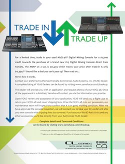
This is a unique ad and a smart move by a company that’s renowned in the HOW vertical market. The copywriting detail in the ad is more than I’d have put in because the landing page (more on that below) can include details that an advertisement can afford to gloss over. Still, it is compelling content for the targeted users and food for thought for those not using Yamaha’s products (will their brand offer a trade-in/trade-up program?).
The unique URL is specific to this trade-in campaign, so that may be sufficient for marketing traffic purposes, as a different URL or even a short link redirect to this landing page can provide the click-through traffic sources to understand when and where users are interacting with the digital promotions and ads. For the print audience, it’s plenty good motivation to plop the magazine down next to the computer or tablet to type in that URL to get the details and fill out any necessary paperwork. This was a timed promotion so the link is now dead — but should redirect to at least the new CL5 page: a miss in an otherwise excellent ad.
How to Advertise to the HOW Market
I’ve highlighted these six ads because of what they have in common: They’re well-crafted, targeted and memorable. Even a casual flip through trade pubs and church production magazines reveals just how big a gulf in understanding exists between these advertisers and the rest of the pack — and it’s significant. Though not all had specific landing pages, topnotch call-to-actions, or the opportunity to connect via social media, these ads still had more than enough going for them to be honored as some of the best HOW market advertisements in 2014.
For manufacturers and systems integrators to maximize their advertising dollars, compare these ads to what your firm and others are doing. There’s a plethora of verbal pandering, generic copy and stock images masquerading as advertising to a market that’s been fed mediocre marketing for decades. Here’s my helpful advice for marketing to this massive vertical market:
- Define your personas.
- Sell your value proposition over your product’s features and benefits.
- Identify felt needs.
- Connect with the user’s pain points.
- Provide a solution, not just a product.
- Don’t talk at the reader; talk to your prospects.
- Learn which images and photographs server your best target demographic in the HOW space.
- Use compelling landing pages that invite the prospect to learn more with a non-existent barrier to entry.
- Track your marketing efforts and measure what’s working — and why.
The house of worship market is over 330,000 unique churches strong in North America alone. Add to that the crazy growth of multi-site and multi-venue church campuses, and the obvious intersection of your products and churches should be crystal clear.
What do you think — are these the best HOW ads of 2014 or do you have another you’d like to have seen listed above? Share your views and links in the comments below.